
Forms Builder
In this article
- Prerequisite
- Forms Administration
- Form Builder - Manage Forms
- Form Builder - Manage Fields
- Content Component
- Display A Form In A Component
- List of Submissions
- Export Submissions in Excel
- Delete Submissions
- Auto Email Response
The form builder allows you to create and customize your own forms, to easily insert them into your website pages and to view the information that people have filled out. You can also check out our training video on how to use the form builder.
Note* the Content Manager needs to be assigned to a page to be able to see and edit its content. You can find out how to do that in the access rights section.
The Forms section is accessible under the account (name) menu, or in the admin sections.
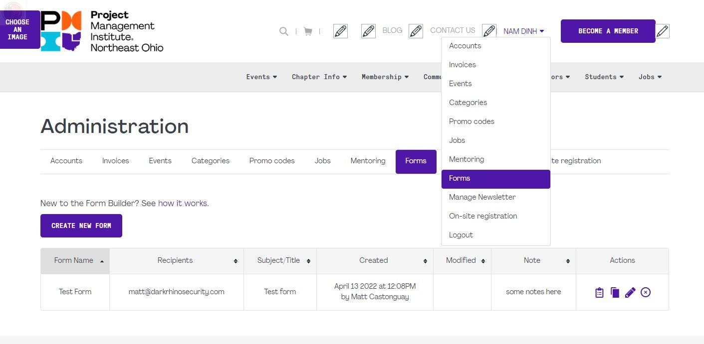
1. To create a new form, click on the button  .
.
2. To edit an existing form, click on the icon  in the Actions table.
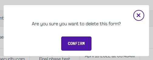
3. To delete a form, click on the icon  in the Actions table. A prompt message will pop up for the confirmation.
4. To duplicate another form, click on the icon  in the Actions table.
5. To view a submission list from a form, click on the icon  in the Actions table.
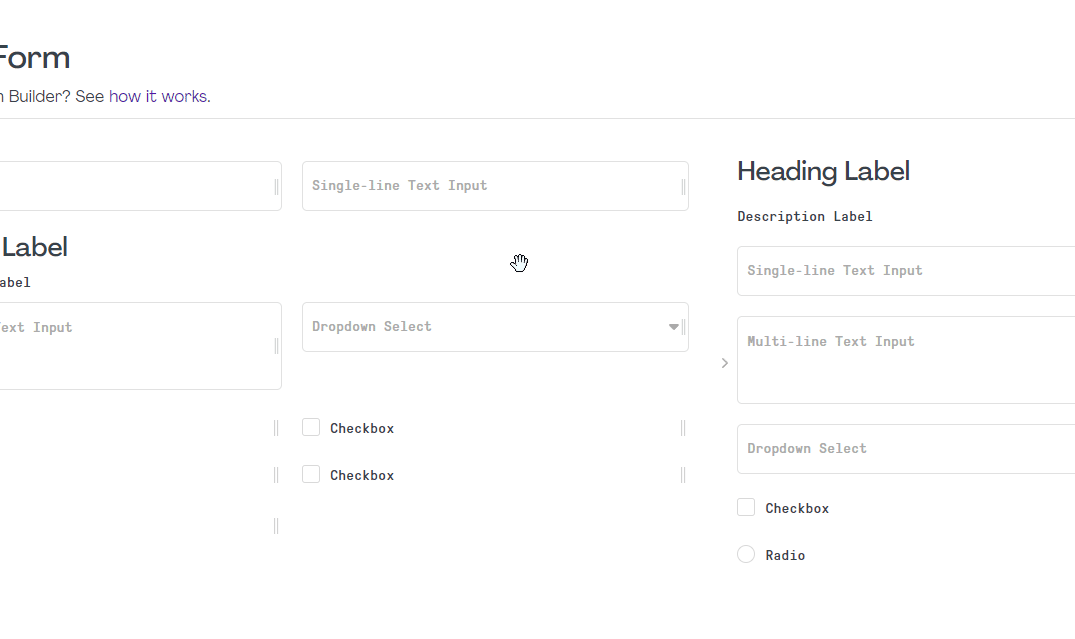
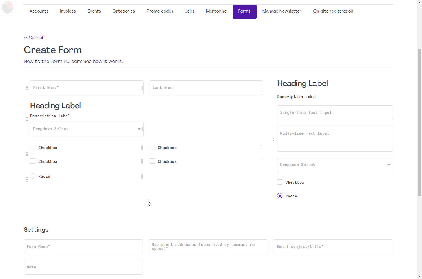
Create a new field
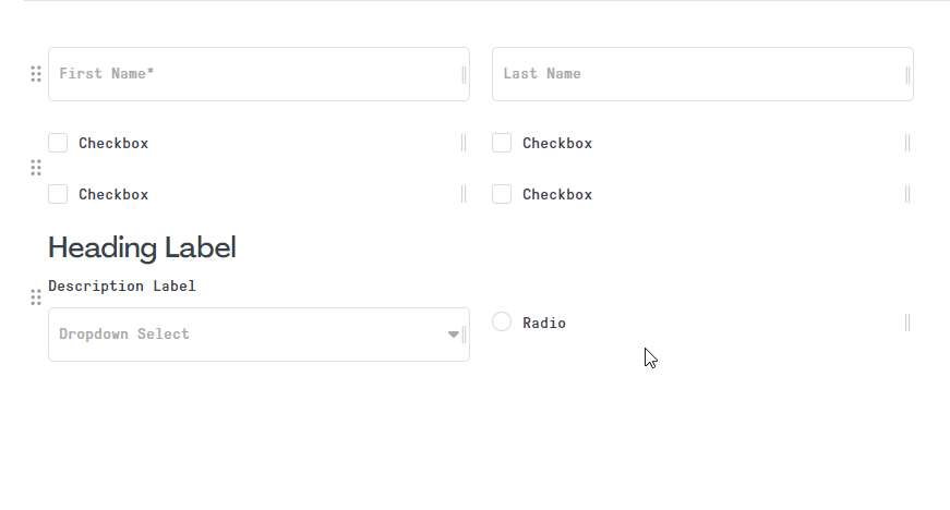
"Drag & drop" one of the premade fields in the template panel into a fieldset (gray box) on the left zone.
Add multiple fields
And organize them at the same time.
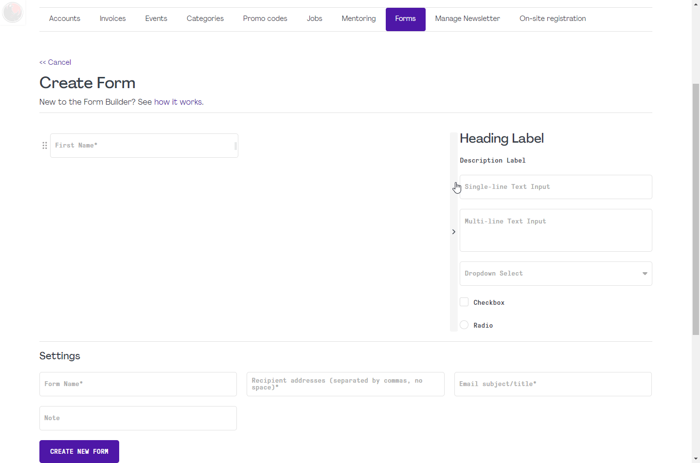
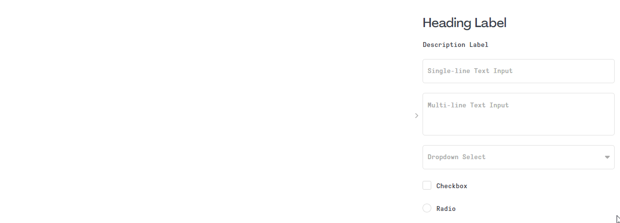
Each element has different options as their name supplies:
- Heading Label a large, bold title to define a group of fields (fieldset). It's best to put it at the beginning of a fieldset. This field takes full line and is not resizable.
Editable options: label - Description Label a descriptive text that can be used as an intro of a form, as a subtitle under a Heading Label, or as a question put above multiple Checkbox and Radio. This field takes full line and is not resizable.
Editable options: label - Single-line Text Input a standard field that can be used as text, email, number input.
Editable options: label, required - Multi-line Text Input a text field that can contain lines of paragraphs.
Editable options: label, required, rich-text - Dropdown Select a dropdown field with manageable options.
Editable options: label, required, selectable items - Checkbox a check field that results collective values when there are one or more adjacent checkboxes.
Editable options: label, required - Radio a check field that results only one selection if there are many choices in adjacent.
Editable options: label, required - More unique fields to come...
Caution! Any changes on the fields of published form may affect the display of submission data.
Edit a field
Hover on a field, click on the edit icon  appearing on the top right corner. A popup will open with different options depending on the field type.
Once finish, click on the button  to save and see the instant changes of the field.
To cancel and close the popup, click on the icon  at the top right corner.
Remove a field or fieldset
Start dragging the field or fieldset containing many fields. A Delete Zone will appear on the right panel. Move mouse cursor with the dragged field into the zone until the Delete Zone become red then drop it.
Caution! Removing a field or fieldset will remove all of their data and it is irreversible.
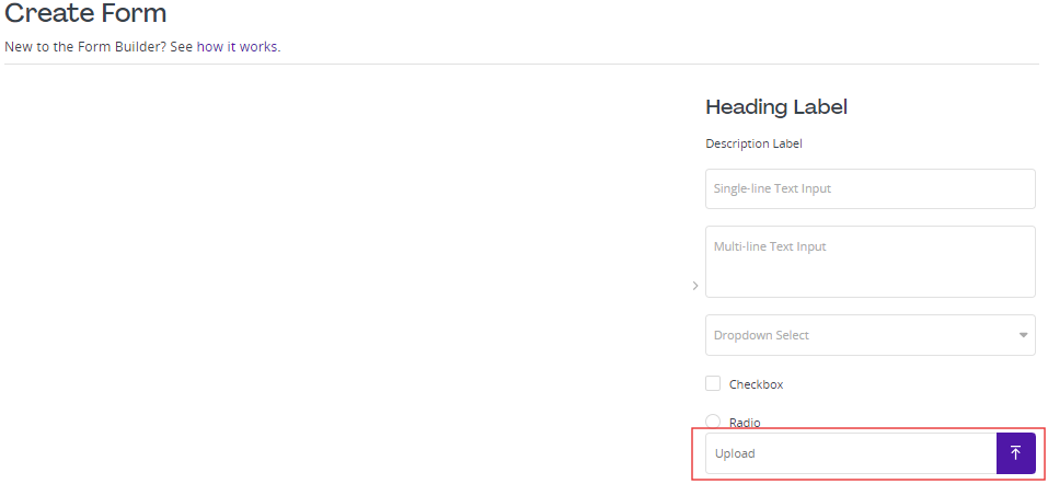
Upload attachments option
Add options for Dropdown Select
On a Dropdown Select field, click on the edit icon . In the popup, at the Option Items, type in the values, and press "Enter" or click on the plus icon  in order to add more items.
To remove an item, simply click on the delete icon  .
.
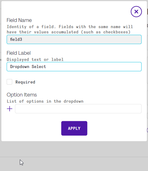
Note: Currently, there are no ways to view the added values in the Dropdown Select field except by opening its edit popup.
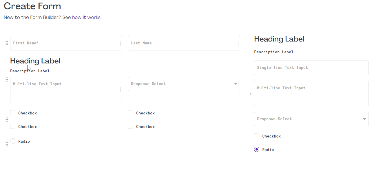
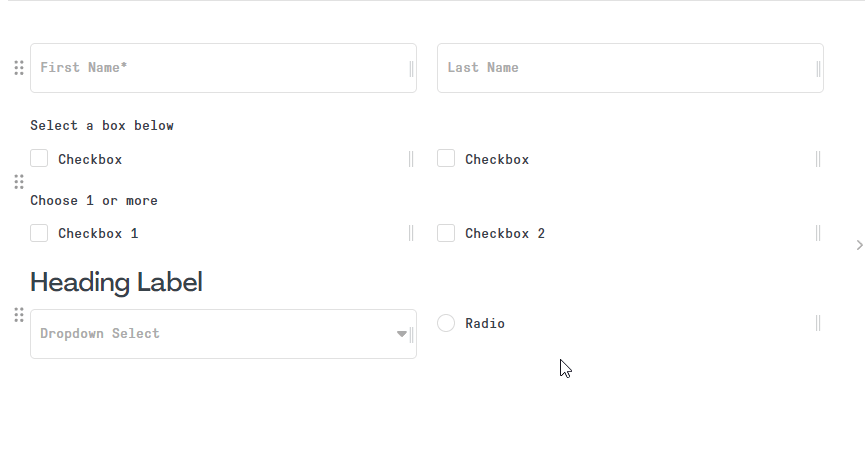
Group checkable choices
The goal is to make multiple choices for end-users.
Assemble the Checkbox or Radio fields next to each other (no other field types in between) to activate field grouping where their Field Name will become one. It can be verified in the edit popup if they have the same name.
Resize fields
Any resizable fields can be sized from five fields up to one full width of a row.
Sort fields
All fields and fieldsets are sortable.
Dragging a field into the bottom zone  will create a new fieldset.
An empty fieldset will be deleted after dropping its last field into another fieldset.
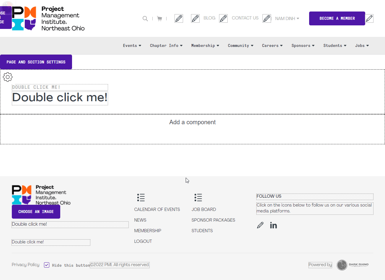
All of the created forms are listed in the settings of the Customized Form component.
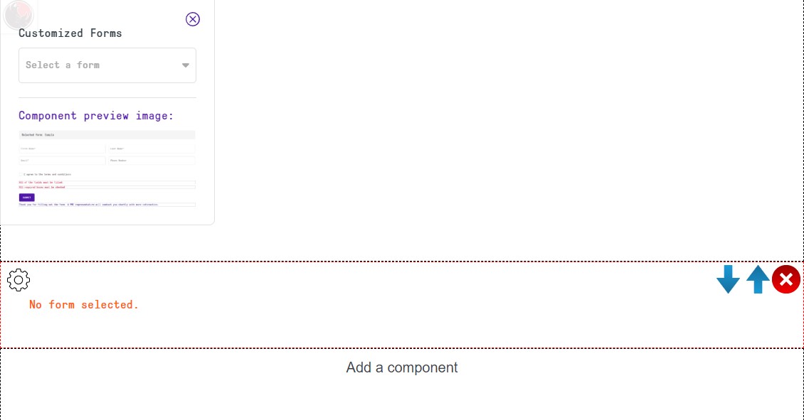
1. Add Customized Form component
On a content page that has Add a component box, click on the box and select the Customized Form. Only the admin or content manager is able to see the message "No form selected." when there are no forms to display, such as when a selected form got deleted.
2. Select a form
On the newly added component, click on the settings icon  , and select one of the forms available in the dropdown list.
Each customized form has its submissions by users saved to make it easier for the persons in charge to keep track of the data submitted. The number of table columns depend on the number fields in a form. Each row displays the corresponding values entered by the applicants.
There are 2 accessible points to view the report:
1. In the Admin Forms dashboard, click on the icon in the Actions table.
2. An admin can see the name and report link appeared in the Component. Click on the icon next to the form name to open the Submissions tab.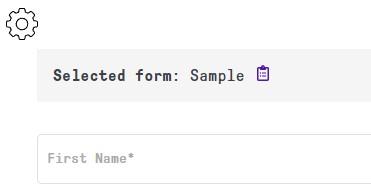
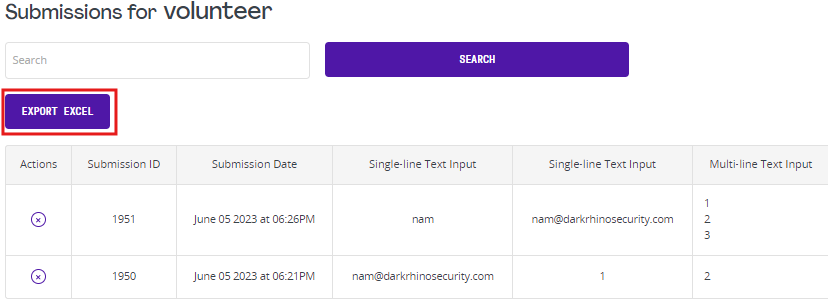

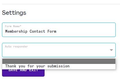
Auto Email Response is a feature that automatically sends a reply email to the applicant of the form. It can be easily managed and you can create as many responders as you like. Then, each form can be linked with 1 email response, but 1 response can be linked multiple forms.
Create/Edit an Email Response
Available fields:
- From/reply email address (mandatory field - email address) to be used for the acknowledgement email message.
- Subject (mandatory field - single line of text) to be used for the acknowledgement email message.
- Email body content (mandatory field - formattable content area that can take both text and images) to be used for the acknowledgment email message.
- Email attachment (optional field - file control) to be used for the acknowledgement email message.
Link a responder to a form
In the Settings fields, choose an existing responder in the Auto responder field.

