
Components
In this article
- Creating a Component
- Component Versions
- Deleting a Component
- Moving Components
- The Rich Text Editor Component
- Images and Files
- Modifying the Component's Content
- Example: Board of Directors Component
- Example: Carrousel or Slider (sliding images) Component
- Adding documents to a page
- Glossary of all Components
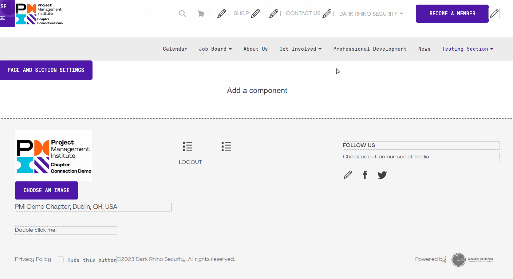
The components are how you construct your web pages using our platform. There are thousands of possibilities of how you can create your page layout configuration. This article will cover basic component usage as well as show some examples of commonly asked questions. You can also view the training video on how to use components here.
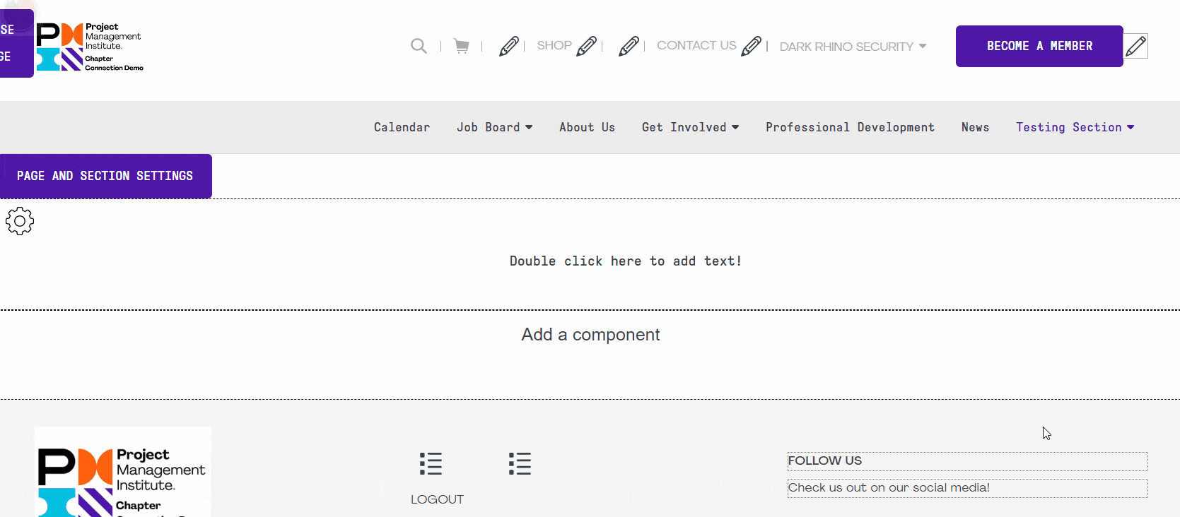
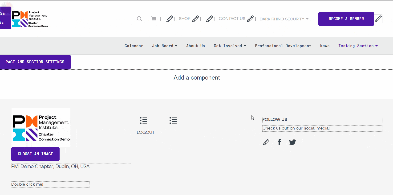
- To create a new component, go to the page you'd like to add a component to, scroll to the bottom and click on "Add a component".
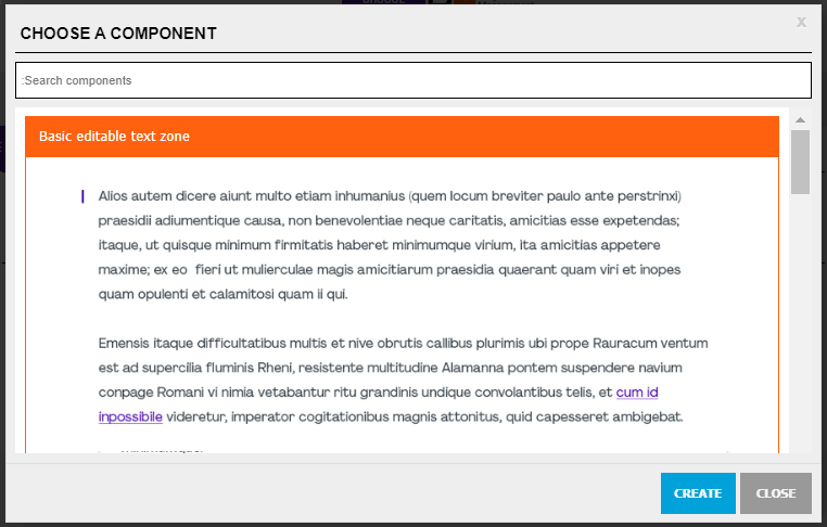
- The component selection menu will open. You can perform a search for a specific component or scroll through and select the component you wish to use by clicking on it.
- Click on the "Create" button to add the component to your page.
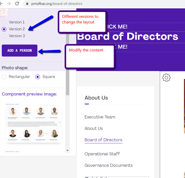
You might have noticed in the component selection menu that different versions of a same component are available. These are simply different layout options for this type of component.
- To select a different version of a component, click on the gear icon
 on the top left of that component.
 - Select the version that you would like to use. You can also refer to the "Component Preview Image" to see what the different versions look like.
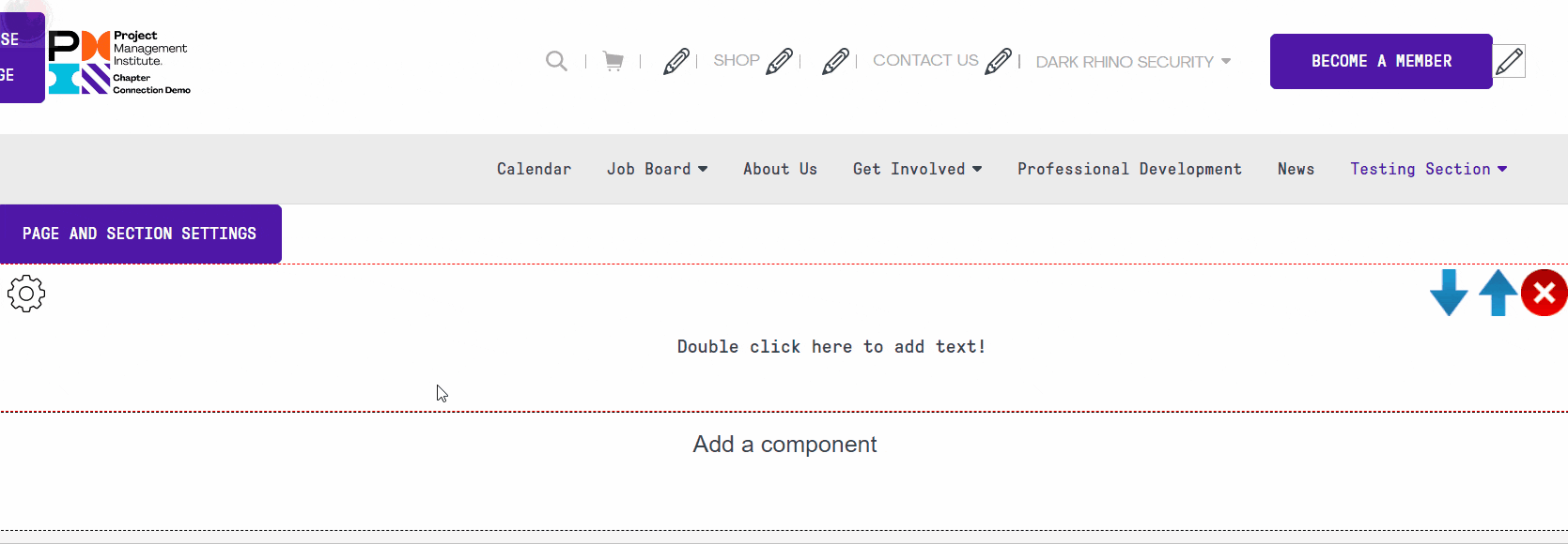
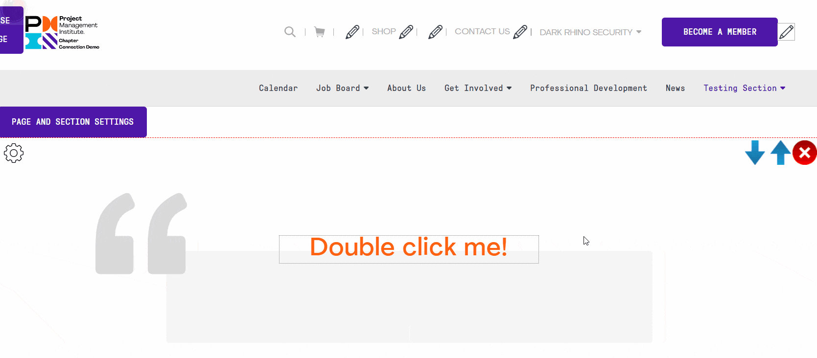
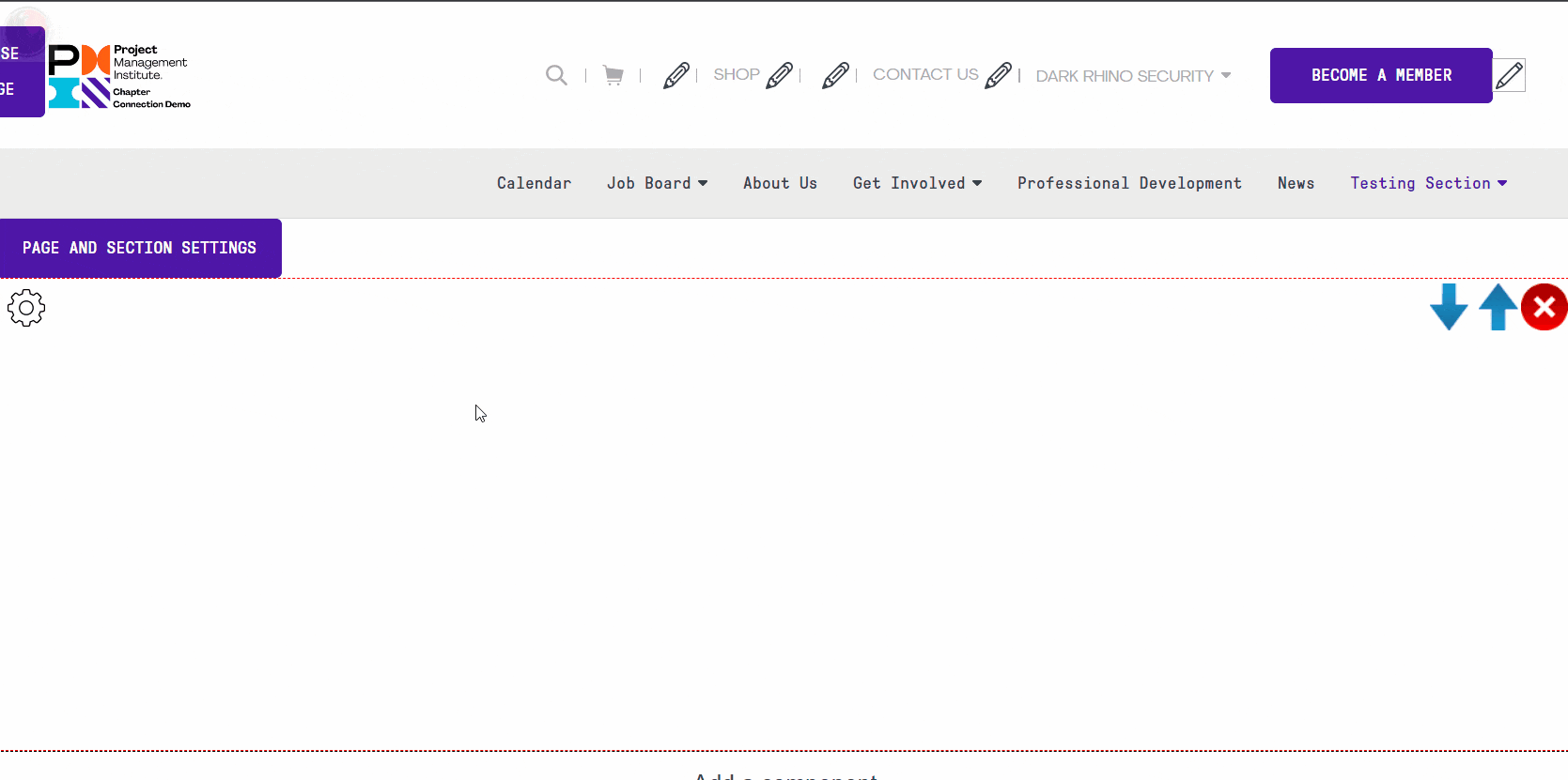
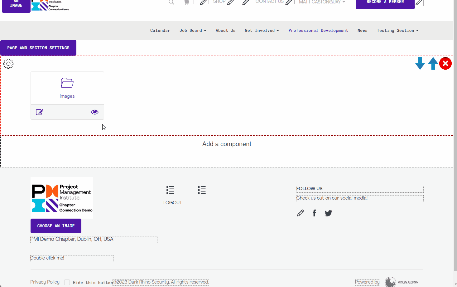
- To delete a component, hover your cursor over the component.
- You should see 3 icons appear in the top right corner of the component.
- Click on the delete icon:

- Click on "Yes" to confirm deleting this component.
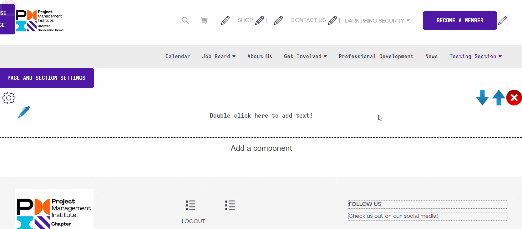
- To move a component, hover your cursor over the component.
- You should see 3 icons appear in the top right corner of the component.
- Click on this icon to move the component up:
 or this one to move it down:
 . If the component is all the way at the top you will not be able to move it up and if the component is all the way at the bottom, you will not be able to move it down.
The "Basic editable text zone" also knows as the "Rich Text Editor" component is the one that you will use most often when adding content to your website. To learn more about using the editor, please check out this training video.
It looks like this in the component selection menu:
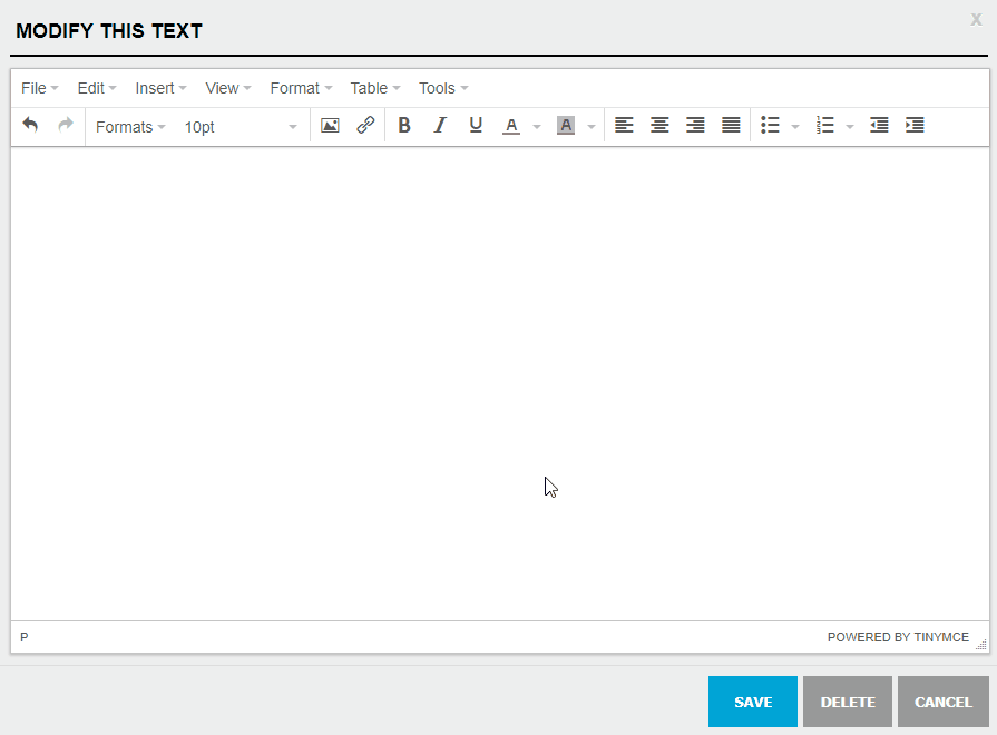
Once you have added the component to your page, you can double-click on its content or on the edit icon  to bring up the rich text editor.
Once an image or a file is uploaded to the file list, you can add them to the content through the Rich Text Editor. Here is how your add an image or file:
- Once you have oppened window that allows you to edit the content of a text zone, click on this icon:
 to bring up the list of files on your website.
 - Go to the file or image that you want to add and click on it to add it.
If you add a file that is not an image, such as a PDF file, it will automatically generate a link to that file. Make sure you watch the Rich Text Editor training video to learn about all of the editor's functionalities.
If you are not using the Rich Text Editor, there are two other ways you can edit the content of your components:
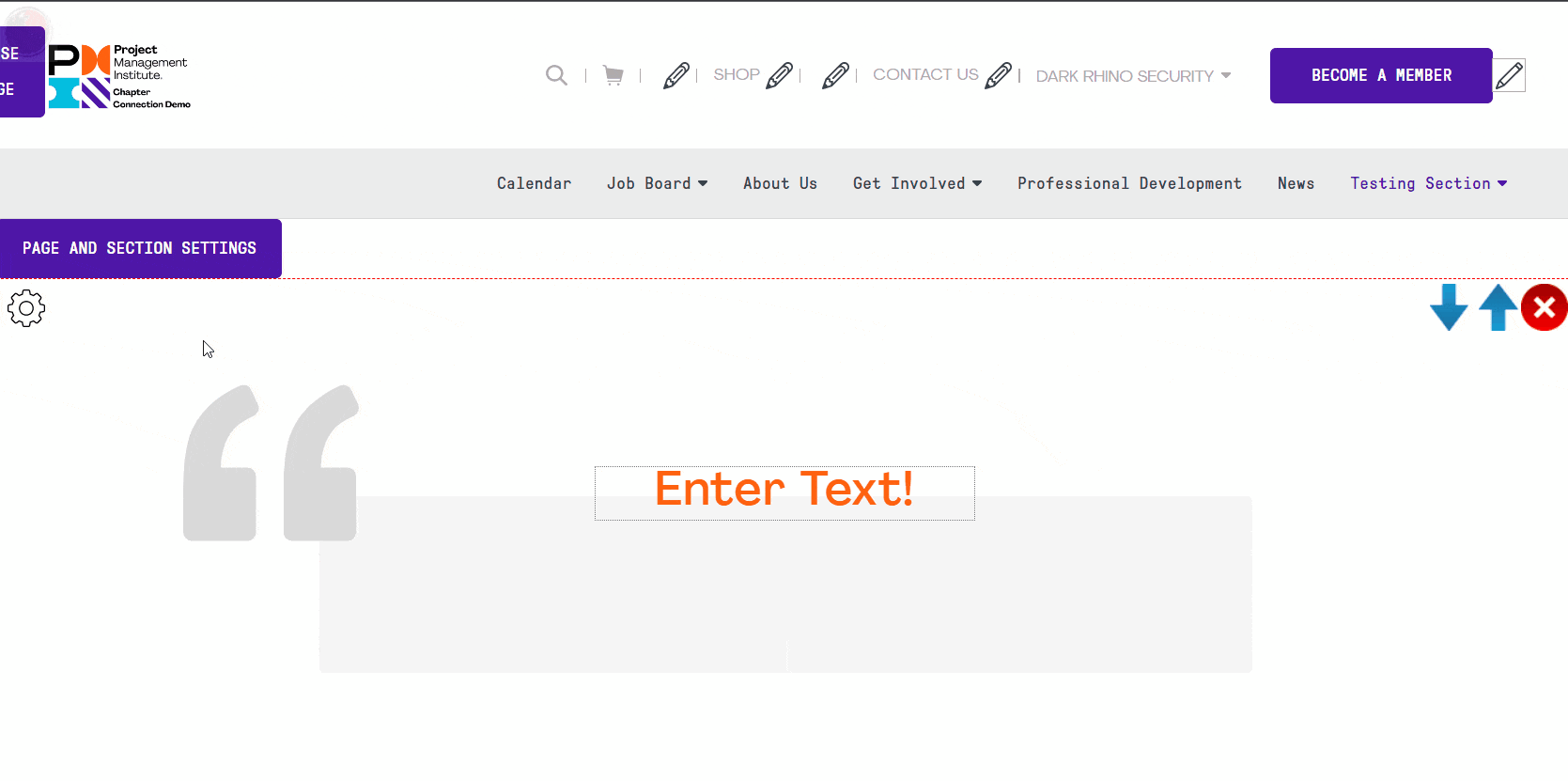
- Labels
- Double-Click on a label to edit its content, and click on "Save" to save the content.
- Other content
- Click on the gear icon on the top left of the component. If there is a button, you can edit your component's content by clicking on it and then filling out the item's information. Here is an example:
The changes to this type of component can be done through the gear icon .
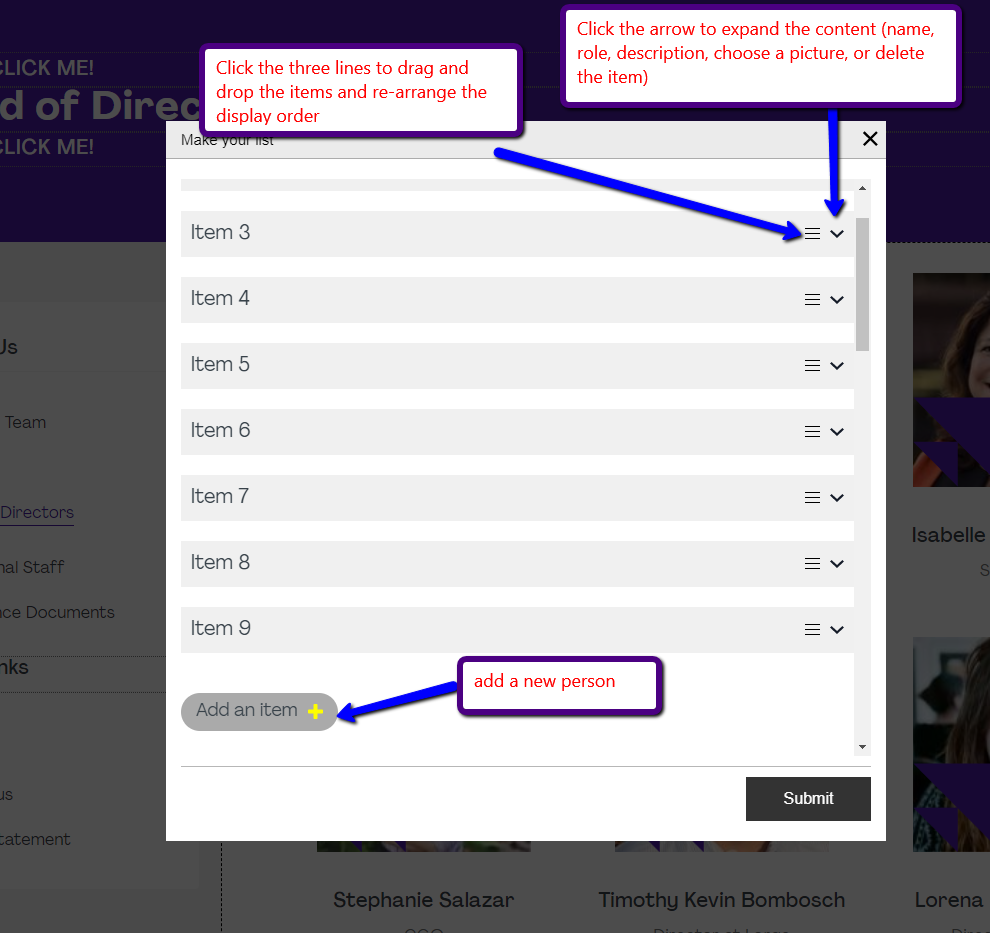
Click on "Add a person" to access the content, to add or remove people, and change the content for each person.
"Items" here are the people that you want to add and you can click on the down arrow icon to expand the information as show below:
This component allows you to have a carrousel of sliding images. You need to add the "Page Header Event component" component and then select version 3 in order to activate the slider version as shown below:
Afterwards, you can click on the gear icon and select "Add Slides" in order to manage your slides or to add new slides. You can add as many slides as you'd like.
The documents component allows you to add a folder from your File List in order to display all of it's documents on a web page. It also allows you to restrict access to who can view this folder.
In order to add the component, click on "Add a Component" in the page that you would like to add this information, then in the search, type "document" and select the Documents component. Note that the 2 versions allow you to display the files in a different visual format.
- Version 1: As shown below, in icons and horizontally layed boxes.
- Version 2: Shows the files in a list, one above each other.
Once you've selected your folder. You can then choose to rename it for display purposes only (it will not actually rename the real folder, but it allows you to put a different text that is displayed). You can also set who has access to it by clicking on the  icon:
icon:
You can view the glossary of all the components here.

